Original image by - Beth Icard
So, our assignment this week was basically to use one of the tutorials Nathan provided us to do something cool, right? Well. I had kind of a hard time with this one, guys. I've had some strange things going on in my personal life, so I've been distracted, and also I wasted hours and hours and hours of time this week working on two other projects I was attempting to fulfill the assignment. I ended up scrapping both in frustration (because I couldn't accomplish what I wanted, not because the tutorials I was using weren't effective), so I was left with very little time to put something together. My bad, my bad.
On a lighter note, I also kind of like what I put together here. I know it's really simple for this part of the semester, but I also think it's pretty. :)
On a lighter note, I also kind of like what I put together here. I know it's really simple for this part of the semester, but I also think it's pretty. :)
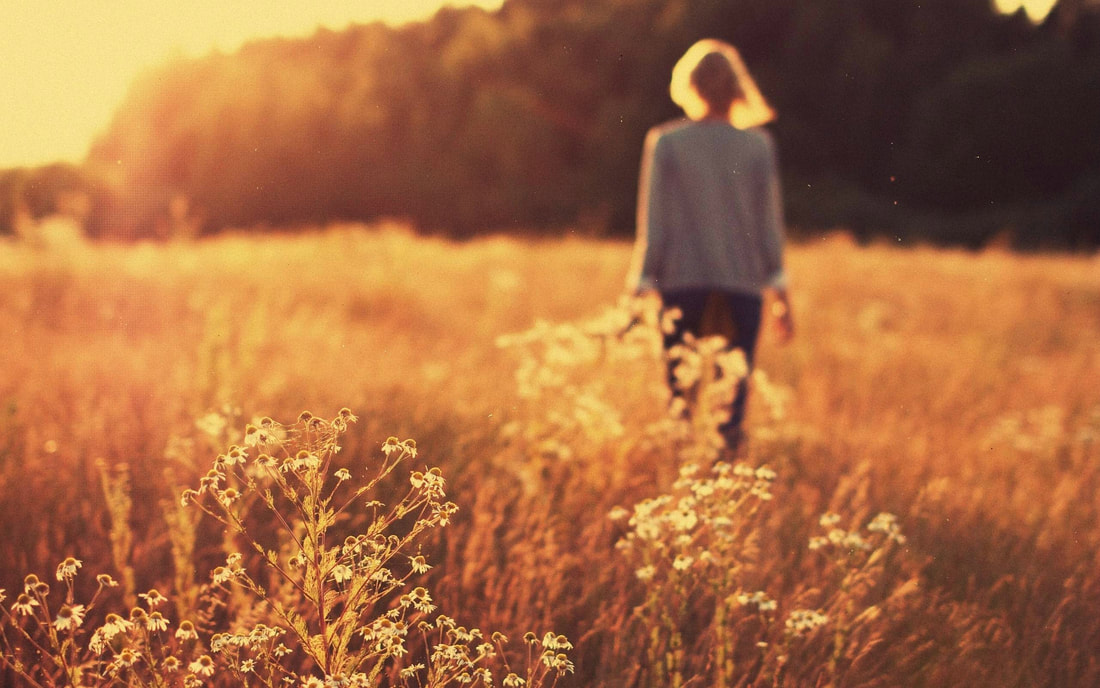
Image found here
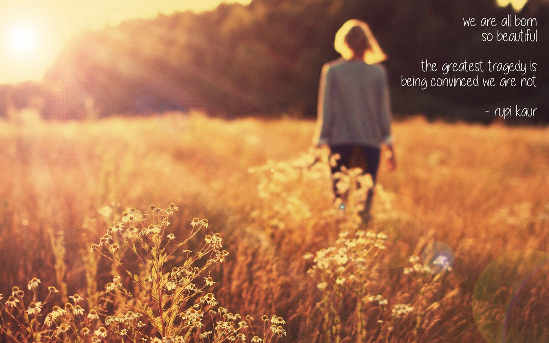
Even though it wasn't one of the tutorials in this week's lesson, I was really interested in this one last week, so I decided to try it out. And here I was again faced with enormous frustrations -- it's a great tutorial, I can see that it would be really effective, but I had a really hard time finding a picture that would work for me. The image used in the tutorial has a really obvious and well-defined light source around which to build the lens flare, but I just couldn't find an image that matched what was in my head and that looked natural with the flare built around it.
So I started to explore. Once I had the above image, which I wanted to work with whether or not it would fit the tutorial, I applied ideas I learned in this tutorial for changing the automated Photoshop lens flare into something I could manipulate. By separating the lens flare into its own layer, I could change its size, shape, position, and even color if I wanted. I played with that until I had it where I wanted it, and then I used pieces of the previous tutorial to add the sun rays. Neither tutorial on its own really worked for this image, but I was pretty happy when I combined elements from both.
So I started to explore. Once I had the above image, which I wanted to work with whether or not it would fit the tutorial, I applied ideas I learned in this tutorial for changing the automated Photoshop lens flare into something I could manipulate. By separating the lens flare into its own layer, I could change its size, shape, position, and even color if I wanted. I played with that until I had it where I wanted it, and then I used pieces of the previous tutorial to add the sun rays. Neither tutorial on its own really worked for this image, but I was pretty happy when I combined elements from both.
Process:
- First I used the healing stamp to clean up all the little specks in the original picture. I'm sure they were intentionally left in or added for aesthetic effect, but I didn't like them, so I made them go away.
- Then I added the pre-fabricated lens flare on its own layer. (First you apply the flare to the background layer, undo the action, create and fill a new layer, reapply the flare -- by using the "last filter" action at the top of the filter menu, not by going back to the render menu and choosing lens flare -- and then change the layer to "overlay" so only the flare is visible, not the layer fill.)
- I added a curves layer that I brightened way way up, added a layer mask and inverted it, and then painted splotches of different sizes all around the light source. Adding a radial blur to this layer created the sun rays, and then I decreased the opacity so it wasn't quite so dramatic.
- I added the text with the text tool.
Design thoughts:
- Right-aligning text kind of goes against my instincts, but I've really liked playing with it in recent assignments. I think I might be a fan.
- Because the figure in the image is out of focus and it isn't necessarily the first thing you see, I really like how the bright light in the top left corner and the sunstreaks below it direct the eye to the right so you can read the text.
- I didn't touch the coloration at all. It's probably overdone in this image, but it worked for what I was doing, so I left it alone.
- Rupi Kaur is awesome.
