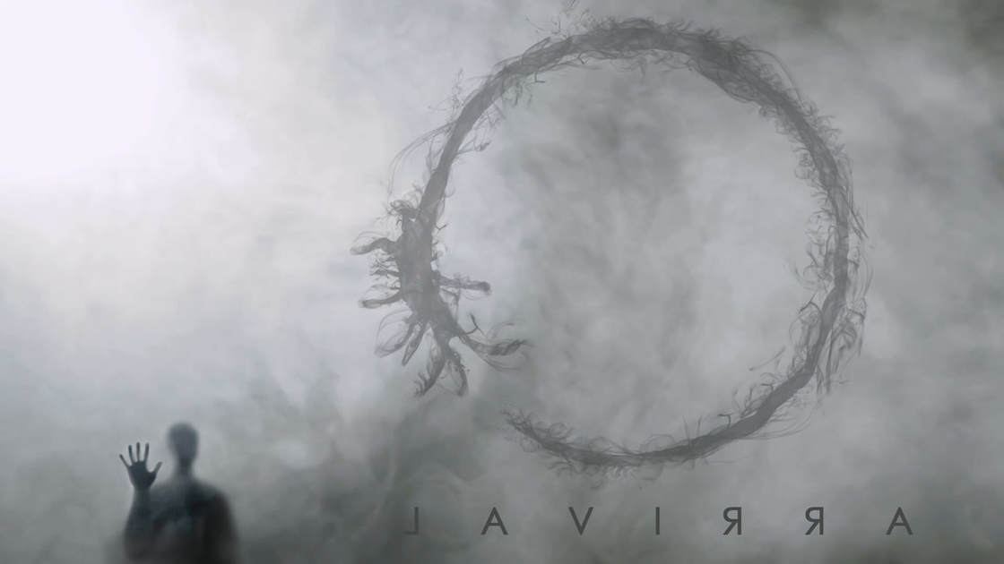
Original image by - Beth Icard
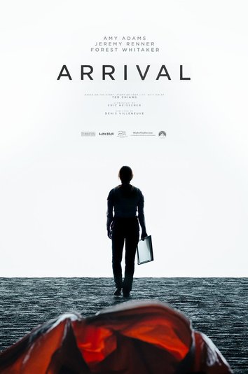
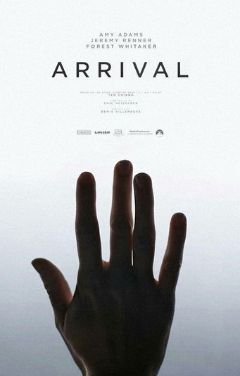
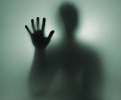
I was so excited to make this one!! Arrival is one of my favorite movies, and it has been on my mind since I posted those fan posters weeks ago. I decided I wanted to make a fan poster of my own. One thing I've noticed is that nearly every poster I've ever seen for the movie (except the composite ones with landscapes and characters and alien ships, etc.) is "told" from the same perspective. We, the audience, see the scene or image from the same perspective as Amy Adams' character. She is on one side of the glass, and we are on the same side with her, and together, we are observing the aliens on the other side:

|
|
|
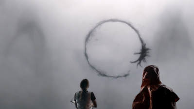
All three images found here
It makes sense for the audience to share perspective with the main character, Louise (Amy Adams). It also makes narrative sense that Louise stays on "our" side of the glass for the whole movie. (Well. Except for this one part late in the story, but that's a particular exception.) This is a movie that is more about humanity and what it means to be human that it is really about "aliens," but even so, we, the humans, need to stay separate from the alien presence, so Louise and the rest of us stay on the same side together.
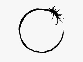
But I wanted to see what happened if I made a poster from the aliens' perspective, which is how I arrived (oh dear, no pun intended, I promise!) at my design. I wanted the human figure (Louise) on the other side of the glass to be relatively tiny compared to the rest of the image. These aliens are huge -- they exist on a completely different plane of perspective. Where other posters usually give equal prominence to the human figure(s) and the other elements of the image, I wanted to make an image where the human figure was a much less visually important element. The alien logogram in the image is closer to the alien than to the human, so it needed to be much larger. I also flipped it so it would appear to be facing the same way, because we the audience are "behind" it. And finally, I reversed the lettering to drive home my point. This is the other perspective.
But I wanted to see what happened if I made a poster from the aliens' perspective, which is how I arrived (oh dear, no pun intended, I promise!) at my design. I wanted the human figure (Louise) on the other side of the glass to be relatively tiny compared to the rest of the image. These aliens are huge -- they exist on a completely different plane of perspective. Where other posters usually give equal prominence to the human figure(s) and the other elements of the image, I wanted to make an image where the human figure was a much less visually important element. The alien logogram in the image is closer to the alien than to the human, so it needed to be much larger. I also flipped it so it would appear to be facing the same way, because we the audience are "behind" it. And finally, I reversed the lettering to drive home my point. This is the other perspective.
Images used:
Process:
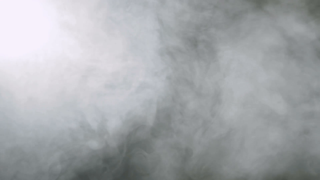
- I set the fog as the background of the image.
- I desaturated the human figure and placed her on top of the fog. I created a layer mask and blended in the edges.
- I used the quick selection tool to isolate the logogram from its background, and then I flipped it, saved the selection, and used the selection to make a new shape out of a smoke brush to imitate the effect achieved in the movie. I placed the logogram in the fog, and then masked it to blend it a bit and make it look like it was in the fog instead of on top of it.
- I used the text tool to place the text and then flipped it.
Design thoughts:
- THIRDS! (More or less.)
- I chose not to aim for much contrast with this one -- it wasn't necessary, given the nature of the image.
- The logogram I used is the alien word for "Louise," the main character's name. :)
- I had so much fun with this one!!!
