Part One
(Yes, I know we were only supposed to do one, but I did two just for fun and to try out both skills.)
(Yes, I know we were only supposed to do one, but I did two just for fun and to try out both skills.)
Before:
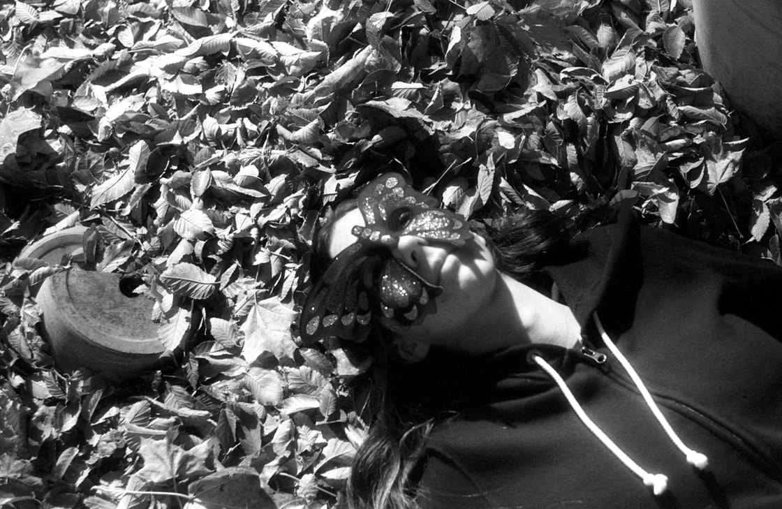
Original photo by - Beth Icard
I took this photo of my cousin five years ago as part of an assignment for a photography class I was taking at the time. I used a film camera loaded with infrared film (my favorite kind of film!) and with a red filter, and then I scanned the negative to create a digital file. I actually chose not to manipulate this picture in Camera Raw this week, because I'd already corrected it way back when I was in class.
After:
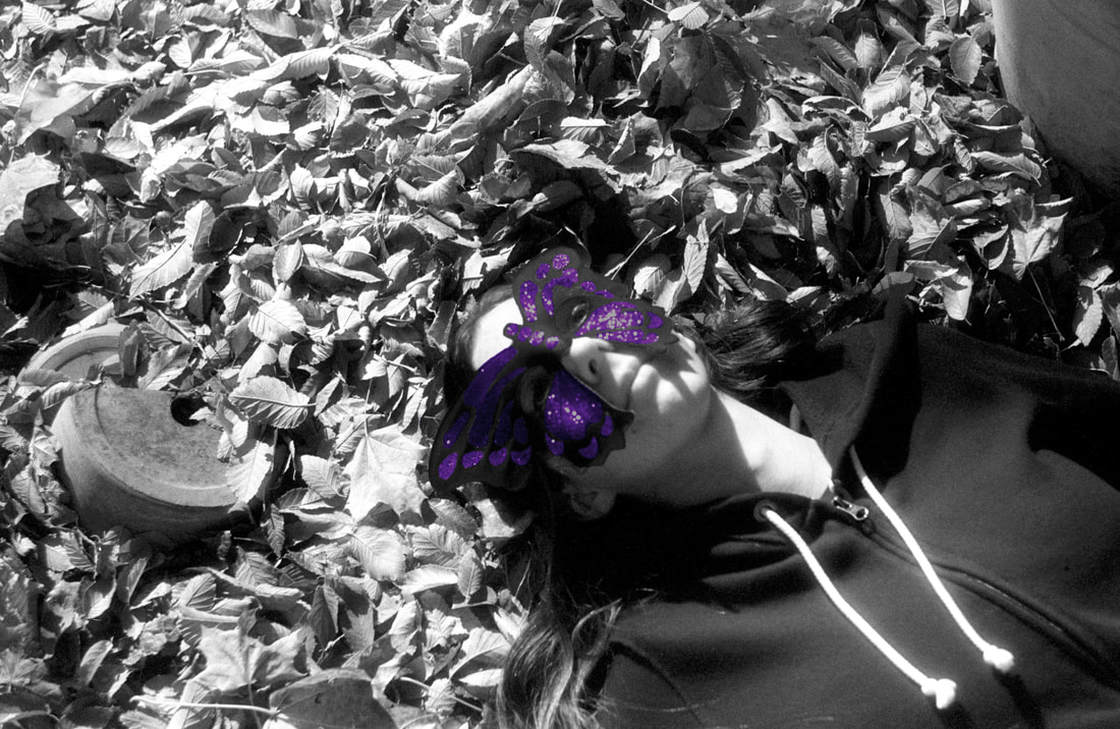
Original image by - Beth Icard
Process:
- In Image Mode, I made the file RGB Color instead of Grayscale.
- In the first layer I created, I used the Quick Select tool to isolate each little pod on the mask and then I filled the selection with purple, using the vivid light category, and 60% opacity.
- In the second layer I created, I used the Quick Select tool to isolate the mask as a whole (minus the eyes) and then I filled the selection with a dark blue, using the hard light category, and 36% opacity.
- I played with the two layers, figuring out which one looked best on top of which, and I ended up with the whole mask layer on top of the mask pod layer.
Design thoughts:
- The mask I originally used in the photo was purple, so I tried to imitate the actual subject I had photographed in the context of an infrared photo.
- I allowed the highlights and whites in the image to look like they're blown out (although I don't think they technically are), because part of the reason to use infrared film is because it lends a glowing quality to the light parts of the image.
Part Two
Before:
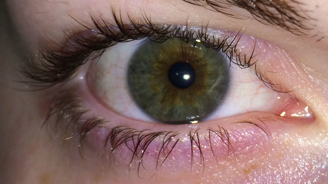
Before corrections in Camera Raw.
|
After corrections in Camera Raw.
|
Original photo by - Beth Icard
Camera Raw Settings Used:
- I adjusted the exposure a bit.
- I adjusted my highlights and shadows/blacks and whites.
- I heightened the contrast.
- I reduced the noise and sharpened the image.
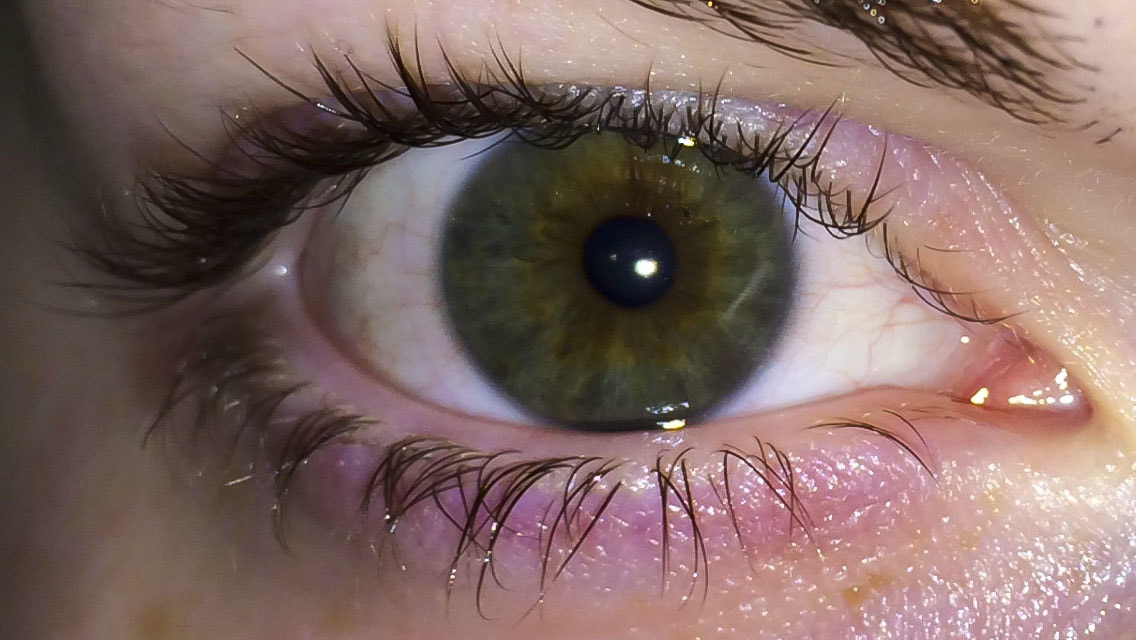
After:
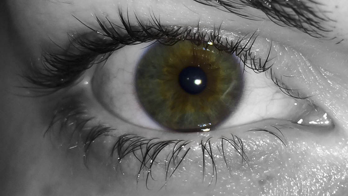
Original image by - Beth Icard
Process:
- I created a black-and-white adjustment layer.
- I used the black brush and white brush to break through the layer and reveal the iris beneath.
Design thoughts:
- If the eyes are the windows to the soul, then surely isolating the iris in full color against a black-and-white background makes some kind of profound metaphorical statement . . . that I don't feel like coming up with at the moment . . .
- Fun fact: this iris is an example of central heterochromia iridium, which is a genetic quirk that results in an iris with two distinct, separated colors -- one around the pupil, one around the edge. (Two other types of heterochromia are total, in which one eye is an entirely different color than the other, and sectoral, where an iris has a section that is a different color than the rest, although not centralized around the pupil.)
- Yeah, I'm a nerd. I collect facts like this.
- Yes, it's my eye. :)
