Original display by - Beth Icard
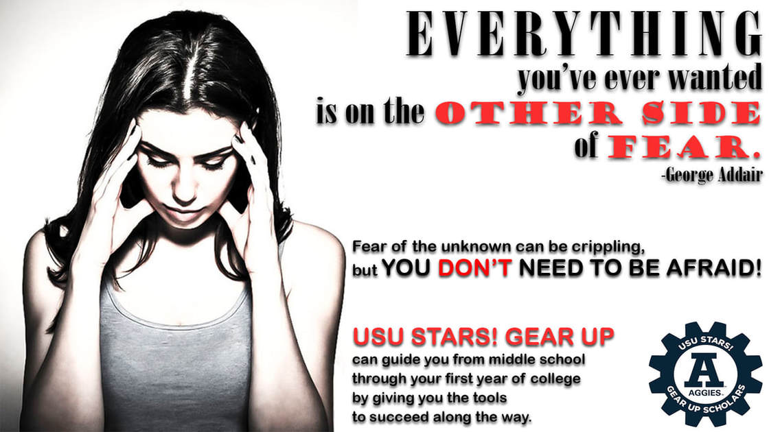
I actually struggled quite a bit with this assignment this week. I spent several hours tearing my hair out over a first attempt that I simply couldn't make headway with. I eventually took a deep breath and asked myself why I wasn't liking what I was working on, and I arrived this answer: there wasn't a "purpose" behind the display I was making. Instead, I'd thrown a cheesy quote over a pretty image I was proud to have taken, an image that nothing to do with anything, really, and, shockingly, I was unhappy with the result. I stepped back, reconsidered, and started over. I started thinking about how college is a scary prospect for most people, so I started approaching the assignment through the focus of "fear." I found a quote I liked worlds better than the first one I'd tried to use, and I found an image that actually fit what I was trying to do. Then I thought about how one of the things that scares me most in the world is the unknown, whether that means starting a class I don't know anything about, or trying to do something I don't know how to do, or engaging in an activity in which I have no idea what to expect. It's terrifying! If I was still a scared little kid thinking about college for the first time, I would want someone to tell me I don't have to be afraid, because he or she is going to teach me how to "do college." With an actual, concrete concept in mind, the project became both doable and fun.

Original image found here
|
After adjustments in Camera Raw
|
Process:
- I created a background layer to the correct size specifications (1920x1080).
- I fussed over the background color for a couple of hours, trying many different color combinations and gradients and patterns before I ultimately settled on good ol' white.
- I added two different text layers:
- The quote at the top
- The two text pods along the bottom
- I fussed over the fonts and sizes.
- I fussed over the leading, tracking, and horizontal scale in the character panel.
- I found an image I wanted to use, cropped it, and adjusted it in Camera Raw.
- I resized and resampled the image and placed it on my background.
- I created a layer mask to blend the right edge of the image into the background in a new layer.
- At this point, I completely repositioned all of my text because it wasn't at all where it needed to be. XD
- I found the USU Stars GEAR UP logo and saved it, then placed it on my background in a new layer.
- I added drop shadows to all of the text.
Design thoughts:
- I deliberately made my picture into a high-key image because I liked the effect for this project and because it fit my color scheme better.
- I ultimately settled on a black, white, and red color scheme (for the most part) and, although it was in some ways almost accidental, I did so because I enjoyed the way the colors mimicked other warning displays I've seen.
- I chose black and red for the text color for the obvious contrast.
- I tried to select contrasting fonts as well:
- Originally for the quote I wanted a serif/sans-serif scheme, but that wasn't working out the way I wanted, so I chose Bodoni MT and Goudy Stout instead; I used Arial Rounded MT Bold for the rest of the text because it was simple (and sans-serif, funny enough) and easy to read.
- I broke the "rule" about normally only using two fonts at a time because I wanted the quote clearly separate from the information at the bottom, and I wanted "other side" and "fear" clearly separated from the other parts of the quote for emphasis; hence, three fonts.
- I tried to clearly separate the three different "pods" of text in keeping with the principles of proximity.
- I considered attempting something fancy with the text (warping, typing along a path, clipping an image inside), but for this specific purpose I wanted straightforward, plain text.
- I wanted the image to be about a third of the final design and the text to be about two thirds for alignment purposes.
- I went back and forth on the GEAR UP logo before ultimately settling on using it.
- On the one hand:
- It's not the right color to fit my color scheme
- It's possibly redundant
- It might clutter up and confuse the text around it
- On the other hand:
- I didn't feel right not including it; it didn't feel "professional"
- I liked that it felt like an official stamp in the corner of my display
- On the one hand:
- I wanted drop shadows because I didn't like how flat and lifeless the text looked without them.
