Original images by - Beth Icard
Okay. So. I went full-on fangirl this week. I admit it. Since we had a business card assignment last semester, I didn't want to make another card for myself, so instead, I took this opportunity to make playful inside-jokey business cards for the four main characters of Supernatural. (I know, I have a problem. I can't help it.)
I followed procedure for building business cards, but obviously, I also played with each character's personality to make these. Really, Sam's is the only viable business card for a "real world" scenario, but I won't apologize for the others, because they were too much fun to make. :)
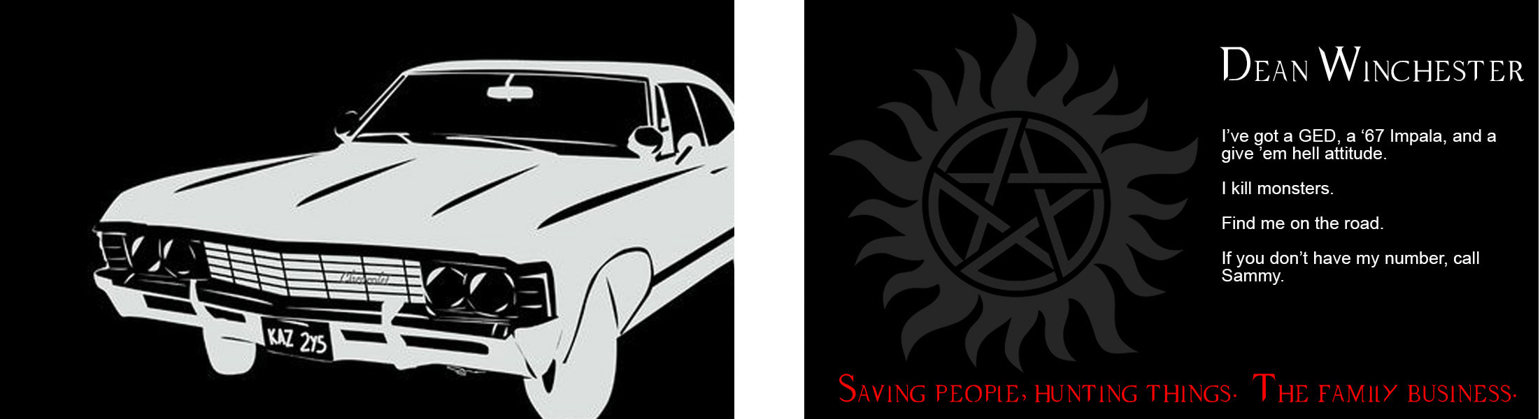
Dean's in love with his car, so that's what I used big and bold on the front of his card. He's got authority issues, so I broke placement "rules" and made it look like the car was zooming into the frame rather than worrying about the fact that the eye goes to the top left corner first. I also made his personal information on the back dripping with Dean "attitude" rather than actual helpful information because, well, reasons.
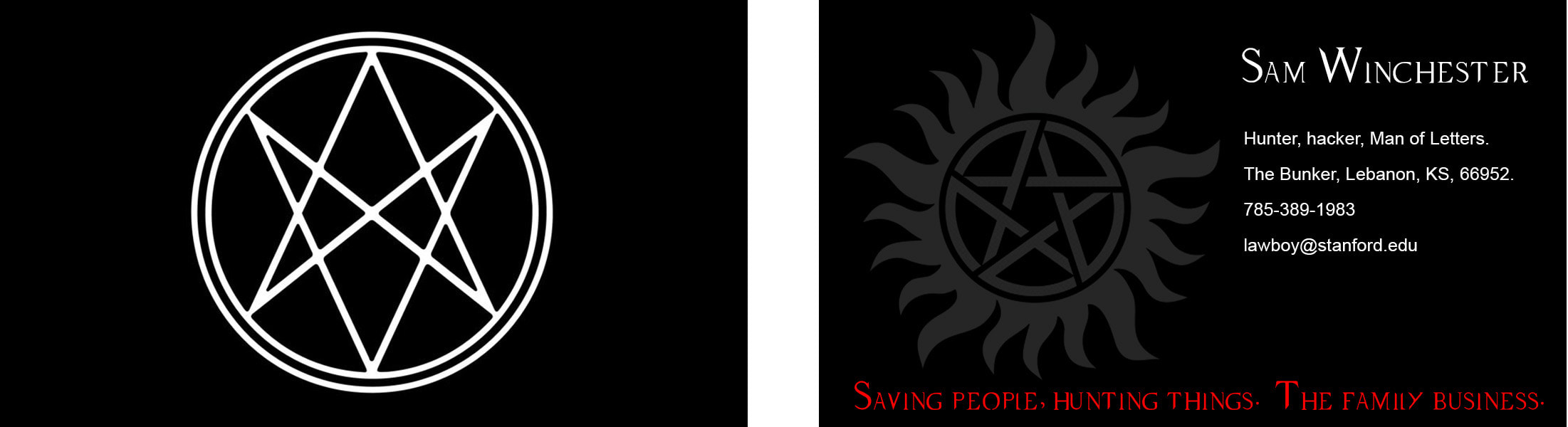
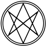
Sammy gets the Men of Letters symbol on the front of his card. He's also practical, so his personal information on the back is actually useful to anyone who possesses his business card. (I even used the real zipcode and phone number format for Lebanon, KS for accuracy.)
Sam and Dean get "Saving people, hunting things. The family business." as the tagline on their cards because it's basically the tagline of the show and they are the two main leads.
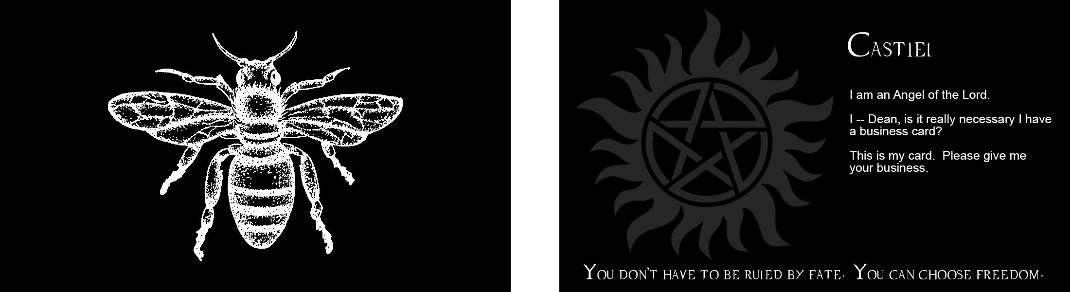
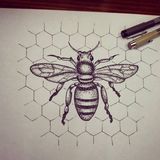
Poor sweet Castiel, who never really knows what's going on and doesn't know what to do with humanness, has probably the least-helpful business card. He would want a bee on the front, just because he loves bees, and while the information on the back would obviously never really make it onto a "real" business card, I was aiming more for character than realism here. I pulled a quote of his for the card tagline that I felt was reflective of his character arc -- he's an angel who "Falls" in favor of Free Will. (Yes, capitalized.)
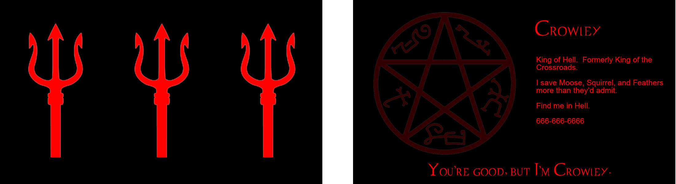
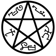
Crowley, the very embodiment of British snark, is a funny combination of formality and irony, so his card is half helpful and half sarcasm. His tagline is a quote that just fits because, well, yes.
I followed procedure for building business cards, but obviously, I also played with each character's personality to make these. Really, Sam's is the only viable business card for a "real world" scenario, but I won't apologize for the others, because they were too much fun to make. :)
Dean's in love with his car, so that's what I used big and bold on the front of his card. He's got authority issues, so I broke placement "rules" and made it look like the car was zooming into the frame rather than worrying about the fact that the eye goes to the top left corner first. I also made his personal information on the back dripping with Dean "attitude" rather than actual helpful information because, well, reasons.
Sammy gets the Men of Letters symbol on the front of his card. He's also practical, so his personal information on the back is actually useful to anyone who possesses his business card. (I even used the real zipcode and phone number format for Lebanon, KS for accuracy.)
Sam and Dean get "Saving people, hunting things. The family business." as the tagline on their cards because it's basically the tagline of the show and they are the two main leads.
Poor sweet Castiel, who never really knows what's going on and doesn't know what to do with humanness, has probably the least-helpful business card. He would want a bee on the front, just because he loves bees, and while the information on the back would obviously never really make it onto a "real" business card, I was aiming more for character than realism here. I pulled a quote of his for the card tagline that I felt was reflective of his character arc -- he's an angel who "Falls" in favor of Free Will. (Yes, capitalized.)
Crowley, the very embodiment of British snark, is a funny combination of formality and irony, so his card is half helpful and half sarcasm. His tagline is a quote that just fits because, well, yes.


Process:
- I made Dean's card first and then used it as a template for the other three.
- I used the artboard feature in Photoshop.
- I inverted the images I used and, in some cases, selected and colored the images red.
- I used color range selection to isolate the honeybee from the background image, jumped it to a new layer, messed with the color until it was straight black-and-white, and then inverted it.
- The process was pretty simple; it was just a matter of entering text and dropping or replacing images.
- I used the alignment tools on the pitchforks.
- I lowered the opacity on the images on the backs of the cards so they weren't quite so overwhelming.
Design thoughts:
- I liked the stark, sleek contrast of a black card with white or red elements on it. I think it's easy to read and more interesting than a white card. Cas got only white elements due to his angelic status. Crowley got only red because of his demonic nature. Sam and Dean got red and white elements due to their dealings with both heaven and hell.
- I found and downloaded the font used in the series for the title card to lend the proper "feel" to the marquee elements of the card (the name and the tagline at the bottom). Then I used a basic sans-serif font for the rest of the information to contrast with the fussier font I used elsewhere.
- I went with basic centered image placement and strong emphasis for the front of the cards. For Sam and Cas, it was one image, one color, centered on the card, no distractions. (I feel like the front of a business card is one time when centering an image is "allowed" rather than discouraged.) Crowley's, though tri-imaged, followed the same pattern.
- Even though it breaks the pattern set by the others, I did consider image placement on the front of Dean's card. I offset the image rather than including it all to give a sense of movement, and I left space on the left to indicate that the image was moving in that direction.
- I used alignment principles from the business card video we watched this week. I put a 2x2" translucent square on the left side of each card to help me consistently offset and align the text, and then centered the images in the square.
