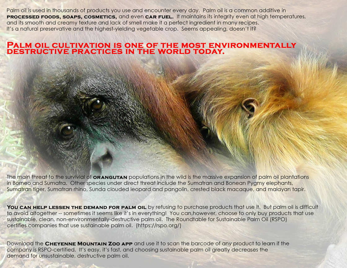
NEW IMAGE:
Original flyer design by - Beth Icard
Once again, Nathan's feedback proved to be invaluable in updating my design. It didn't even occur to me to use both sides of the flyer (despite what we've been reading, silly me), but Nathan suggested the above changes and now I'm much happier with the final project. I allowed my sections of text to, in Nathan's words, "breathe" a little, and by moving pieces to the front or to the back, the overall design became much less cluttered.
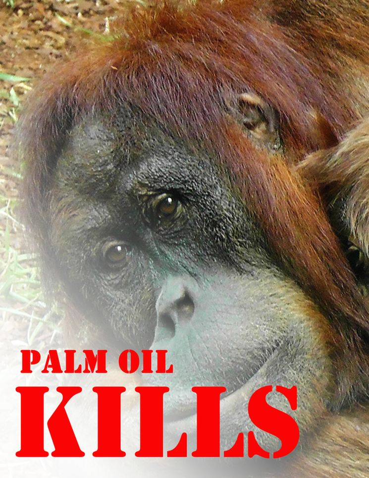
OLD IMAGE:
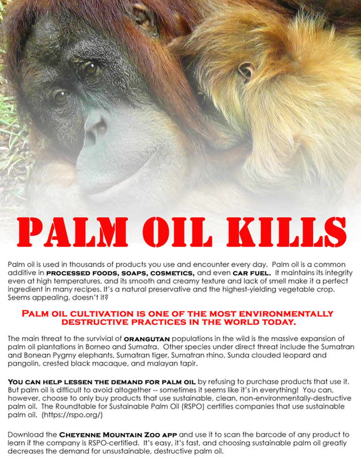
Original flyer design by - Beth Icard
Process:
- Because we had to use public-domain images only this week, I found the orangutan image I wanted to use on Pixabay.
- I created a project in Photoshop to fit the right size and resolution requirements.
- I placed the image in a new layer and created a layer mask, then used the gradient tool to fade the image into the background.
- I used the text tool to place the text in successive new layers and aligned the left edges of all of the left-aligned text.
Design thoughts:
- This project kind of frustrated me this week, because I feel like I didn't do enough "designing" of the flyer. I know it's probably too wordy, but I couldn't figure out how to avoid that and still include all of the information I felt was pertinent.
- Also due to the wordiness, I know that the flyer ended up blocky. I originally intended to try creating a curve design within the rectangular flyer with the text, as was suggested in the reading two(?) weeks ago, but it simply wasn't working for me. So. Ugh. :(
- I did deliberately try to pull out specific key words and phrases by using a contrasting font, like the reading I mentioned above suggested. I also stuck with black and red on a white background for obvious contrast reasons. I also chose red for its association with blood, because I hoped to evoke the bloody consequences of palm oil production in the flyer.
