Now with alternate image . . .
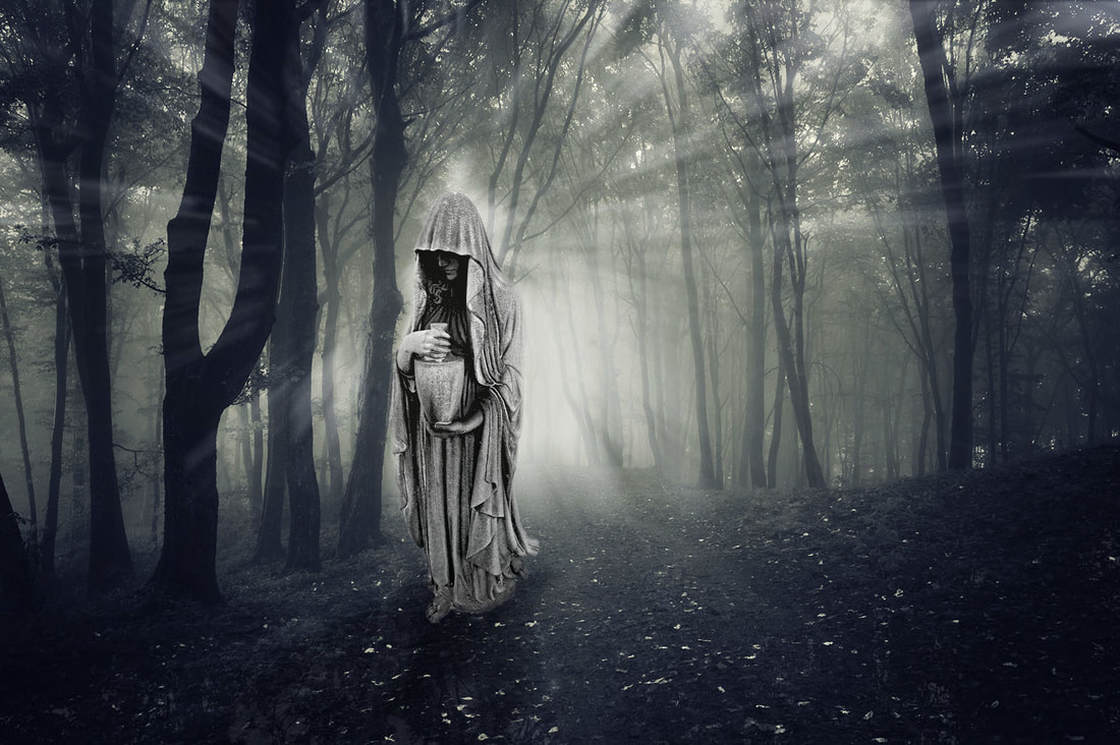
Original image by - Beth Icard
This was a really fun project to work on. I played around with a couple of different concepts for the assignment this week before I settled on this one, but I'm so glad I eventually arrived here.
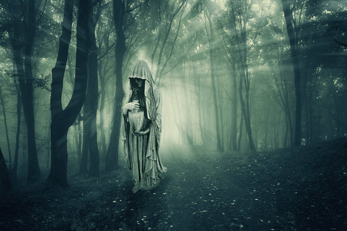
Original image, alternate version by - Beth Icard
(Alternate version inspired by Nathan's suggestions.)
(Alternate version inspired by Nathan's suggestions.)
Process:
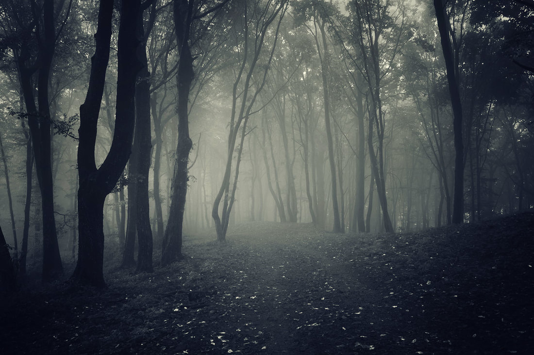
- Once I found the background image I liked (which took some doing), I copied the red channel and adjusted the levels to isolate the brightest highlights. Then I created a luminosity mask selection of the brightest whites.
- I made a new layer on top of the background and filled the selection with white. I copied that layer to another layer.
- With the first copy of the white layer, I made the light spangles on the forest floor. I rotated the layer 180 degrees and manipulated the size and shape until I was happy with the placement of the sunspots, and then set the blending mode to luminosity at 13%. I didn't want it overwhelming, I wanted it only just noticeable.
- I used a radial blur set at 80 and zoom to make the streaks of light coming through the trees. I set the centerpoint in the light part between the two trees on the leftish side of the image.
- I added an outer glow to the beams to make them stand out and make them look more realistic and set the blending mode of the layer to soft light.
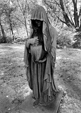
- I made a selection of the figure I wanted to use and duplicated the layer into the other file.
- I sized and placed the figure, masked it, and brushed over the edges at a low opacity just to soften the jarring effect of the image so it looked more like it belonged.
- I added two drop shadows to the image and made each into its own layer so I could manipulate them. I rotated the shadows and distorted them into the shape I wanted, then placed them and added a slight gaussian blur.
- I finished off with a levels adjustment layer on the statue only to brighten and fix the contrast a little.
Design thoughts:
- Okay, confession -- at first, I was just playing. I was putting together things and ideas that I thought looked cool just for the heck of it. I admit it.
- But! But I actually did put thought into this. I thought a lot about contrast and playing against expectation in this one.
- You wouldn't necessarily expect to see sun rays in a gloomy forest like this, but in the right place with the right angle of light (and especially in mist like this), there would be beams everywhere. I also enjoyed playing with the idea of an eerie veiled figure being illuminated from behind where usually it would be a brighter, more angelic thing standing in the light.
- At first I was interested in the image of the woman simply because the picture of the statue was as close to what I was looking for as I could get. I'd originally hoped for a photo of a real woman, but I couldn't find what I wanted. Ultimately, though, I like this even better. I love the contrast of the stone figure against the forest backdrop, and now I love that it's not a live person, but a statue instead.
- I thought about colorizing the statue, but I actually like the contrast of the color backdrop with the black and white figure. The image overall is monochrome enough that I don't think it seems out of place for the statue to be black and white, but I also think that its black and white nature gives it a little extra spooky edge.
