Original display by - Beth Icard
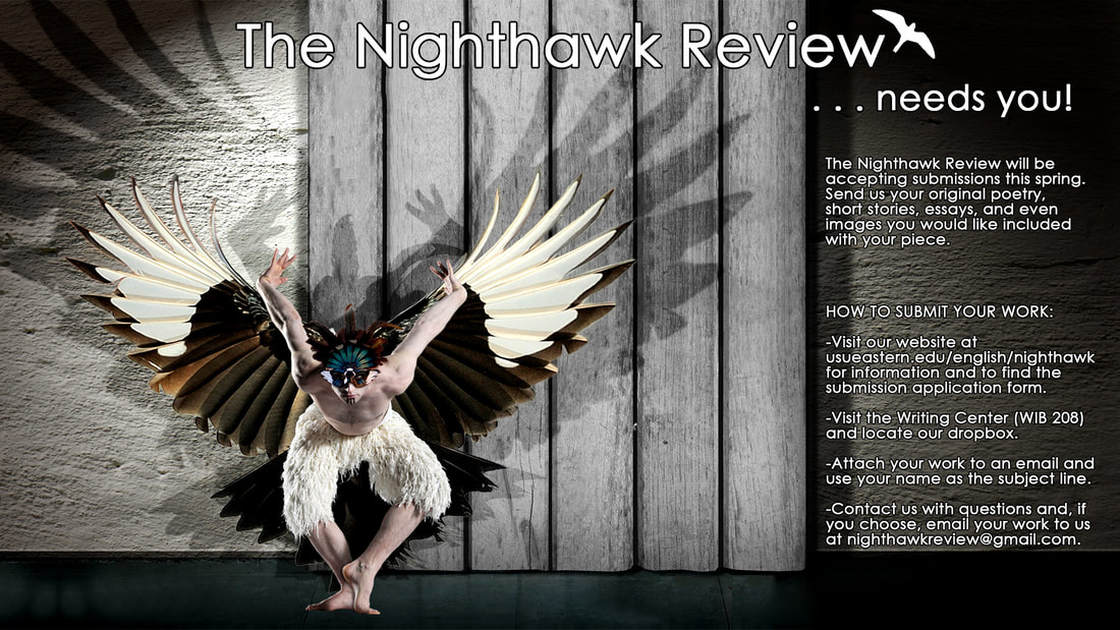
I work at the Price branch campus of USU (USU Eastern) and the first thing that came to mind when I was reading this week's assignment was our literary magazine, The Nighthawk Review. It's published every spring, so I knew it would work for this assignment's timeline. I'm working with the faculty member in charge of the magazine. He doesn't yet have a set submission deadline in mind, which is why I didn't include one. I made the digital display in accordance with the assignment's resolution and size requirements, but I also actually made a second much larger and much higher-resolution version that we're planning to use as a huge poster on campus. :)
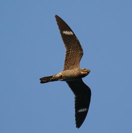
I've been thinking about this assignment for weeks and weeks; it's been in the back of my mind for most of the semester. Originally, I intended to create my angel/dancer figure using physical elements of the nighthawk, for obvious reasons. In fact, that has been something that's bothered me for years -- neither the students who work on the magazine, nor the faculty member who oversees them, ever recognize the fact that a nighthawk is a specific, particular species of bird. They usually just slap some kind of random hawk-bird on the year's design, which always drives me insane. This was my own private crusade against their constant oversight. XD
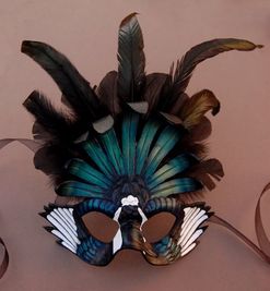
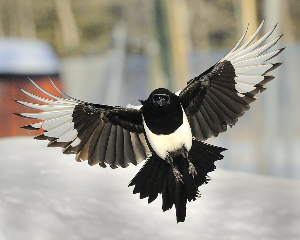
However, it turns out that the actual physical features of the nighthawk didn't really suit the vision I had in mind. It's a beautiful bird, but it's kind of an odd little thing. I shifted my plan slightly and used magpie features instead (magpies are one of my favorite birds!), although I wasn't willing to relinquish my nighthawk crusade altogether. The silhouette in the title is a nighthawk. So. There. ;)
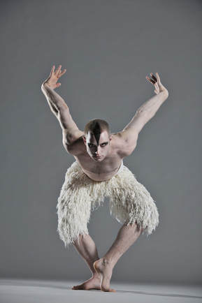
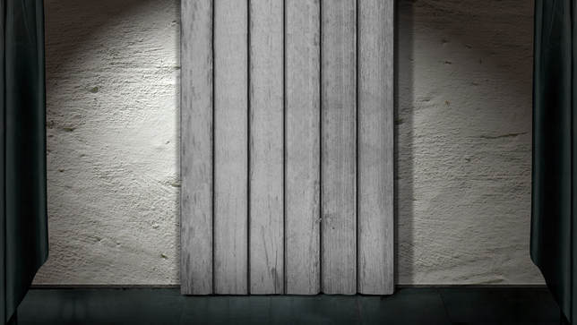
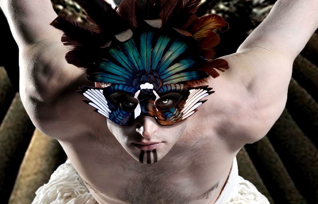
I knew I wanted to use a dancer's image for the human figure. I assumed I'd be likelier to find a person bent into the shape I wanted if I looked at dancers instead of "normal" people. I found the image I used in a collection of pictures from Matthew Bourne's mostly-male ballet production of Swan Lake, and I was really happy when I did. He was shaped exactly the way I wanted. Lastly, I looked for the stage background I wanted and for a magpie-themed mask I could use for added drama.
I've been thinking about this assignment for weeks and weeks; it's been in the back of my mind for most of the semester. Originally, I intended to create my angel/dancer figure using physical elements of the nighthawk, for obvious reasons. In fact, that has been something that's bothered me for years -- neither the students who work on the magazine, nor the faculty member who oversees them, ever recognize the fact that a nighthawk is a specific, particular species of bird. They usually just slap some kind of random hawk-bird on the year's design, which always drives me insane. This was my own private crusade against their constant oversight. XD
However, it turns out that the actual physical features of the nighthawk didn't really suit the vision I had in mind. It's a beautiful bird, but it's kind of an odd little thing. I shifted my plan slightly and used magpie features instead (magpies are one of my favorite birds!), although I wasn't willing to relinquish my nighthawk crusade altogether. The silhouette in the title is a nighthawk. So. There. ;)
I knew I wanted to use a dancer's image for the human figure. I assumed I'd be likelier to find a person bent into the shape I wanted if I looked at dancers instead of "normal" people. I found the image I used in a collection of pictures from Matthew Bourne's mostly-male ballet production of Swan Lake, and I was really happy when I did. He was shaped exactly the way I wanted. Lastly, I looked for the stage background I wanted and for a magpie-themed mask I could use for added drama.
Images used:
Process:
- I created a document of the right size. (Well. Actually, Photoshop glitched somehow and made it the wrong size, despite what I'd specified, but Nathan helped me straighten that out and I fixed it.)
- I used the quick selection tool and select and mask to isolate the dancer from his background, the mask from its background, the nighthawk from its background, and the left wing, right wing, and tail (separately) of the magpie from its background. (And it took freaking forever. Sigh.)
- I set the stage as the background, then placed the dancer in his own layer and used the transform tool to size him.
- I placed the left wing, right wing, and tail in layers below the dancer, and transformed and warped them into the size and shape I wanted.
- I placed the mask in a layer on top of the dancer and transformed and warped it into the size and shape I wanted.
- You can't tell in the lowish-resolution image above, but I worked a lot with the dancer's face. (It'll show on the high-resolution poster version of the image.) Here, have a closeup:
Process, continued:
- I painted black around the dancer's eyes (below the mask) to imitate the shadows that would be there if the mask and the dancer were part of the same image. I selected the eyes themselves and brightened them with an adjustment layer. Then I painted a bright silver (in "overlay" mode) over the irises to make them look eerie and alien. I painted a dark ring around each iris because I liked how dramatic and spooky it looked.
- I created level adjustment layers for each wing to correct and brighten the color a little.
- I painted a shadow onto the dancer's right ankle to imitate the shadow the left foot would cast in that position if the lighting on the dancer matched the lighting on the stage. I also painted the three black lines on the dancer's chin for dramatic and cool effect.
- I loaded the selections I'd saved of each wing and the tail and mask, and then created new selections of each arm. I painted inside the selections with black and placed them behind the dancer, warped and transformed them into the shapes I wanted, lowered their opacity to 40%-45%, and set them to "overlay" mode.
- With the text tool, I placed the various groups of text I used. I put a black stroke around the font so it stood out a little from the background.
- The text along the right wasn't as easy to read as I wanted, so (per Nathan's excellent advice), I painted the wall behind that section darker and set the layer to "soft light" mode.
- I loaded the nighthawk selection I'd saved and painted inside it with white, outlined the shape with a black stroke, and placed the image in the title. Because reasons. ;)
Design thoughts:
- I tried to keep the image more or less in thirds, although the angel/dancer does bleed over a bit.
- I chose white text for the contrast against the dark background and I grouped pertinent information together.
- Although it was ultimately for practical reasons, I enjoyed how the text being placed so far to the right mimicked the effect of right-aligned text.
- I wanted shadows behind the dancer not only because I was trying to follow the rules of nature, but for the nice repetition they'd provide.
- I don't know, mostly I just had fun with this one and made the image that was in my head.
