|
|
Original images by - Beth Icard
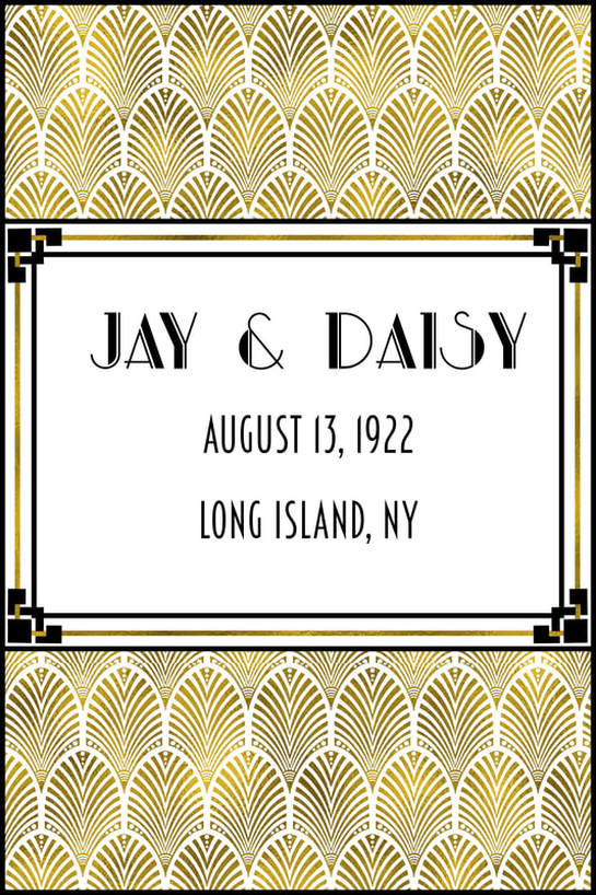
For a while, I was worried I wouldn't have a good idea for a project this week. I was looking through images I could make into a pattern before I even had an idea. I figured I'd build the pattern first, and then design something around it. I'm feeling the Art Deco thing lately, so I was looking at Deco shapes and patterns when the notion came to me: wouldn't it be fun to make a wedding menu for Jay Gatsby and Daisy Buchanan?! Obviously that's what I had to do!
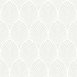
I found a silver Deco wallpaper swatch that I loved (I actually wish I had some in my house) and I made a pattern out of it. First I made a pattern out of the image as it was, and then I made a second version with just the grey positive space isolated and the white negative space deleted so I could manipulate or color the pattern if I wanted to. Obviously my colors had to be black, gold, and white. It's Art Deco, of course that's what I had to do. (Although, confession -- I'd been leaning toward colors like that, but I didn't choose that scheme specifically until I'd looked at a couple "how to throw a Gatsby party" websites and noticed a pattern in the colors.) I didn't just want to use a flat yellow color for the gold, so I used a tutorial to create a gold leaf effect. Here is the tutorial URL: https://vimeo.com/121374073. I tried to link the page to the word "tutorial" like I normally would, but Weebly thinks the address is invalid. Whatever. It's not.
Did I use August 1922 for the imaginary wedding date of our favorite doomed couple because that was when Gatsby died in the book? Why yes, yes I did.
|

|
|
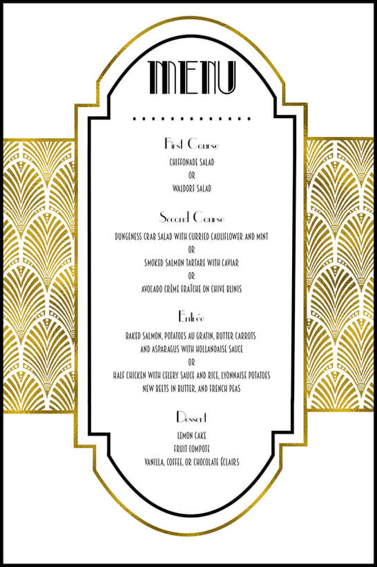
Once I figured out what I wanted to do, I got totally into this project and started researching like a madwoman. I looked for information about what types of food were actually popular during the '20s. There was surprisingly little information about actual weddings, but I did find useful ideas about what foods may have been in high demand at the time, and I actually looked at contemporary menus, like the Delmonico's menu at right, for further ideas. I pulled almost everything that ended up on my menu from these sources, although I put the dishes together differently.
I couldn't actually find anything about wedding cake (all I could see were ideas for modern '20s-inspired cakes), so I borrowed a couple of desserts from the Delmonico's menu and I threw in lemon cake because, to my memory, Daisy serves lemon cakes at one of the get-togethers in the book. I'm having trouble linking outside websites like earlier on the page, so here are the links to the sites I got most of my information from: https://food52.com/hotline/20100-what-would-you-serve-at-a-great-gatsby-party https://www.cateringconnect.com/blog/great-gatsby-1922-inspired-menu-items/ |
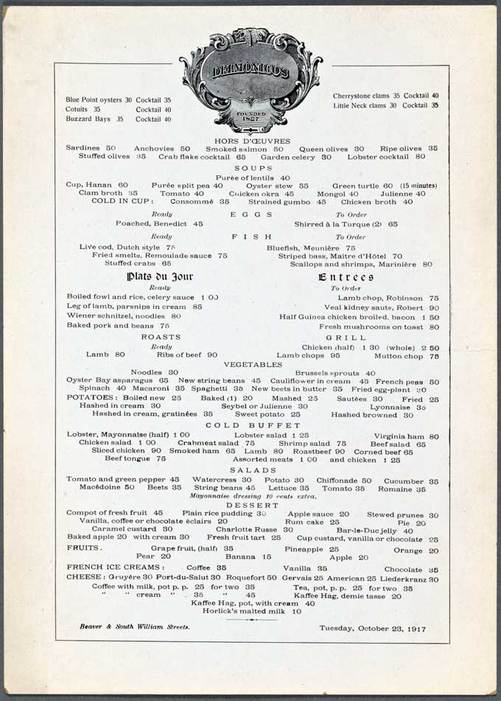
Image found here
|
Process:
- I used artboards to set up my project so I could design the front and back against each other.
- I saved my pattern swatch as a defined pattern, and then made a second version of the pattern by isolating the grey part of the image with the color range selector and defined that as a pattern, as well.
- I used the rectangular shape tool and the pen tool to build the shapes I used, based on Art Deco designs I'd been looking at. And yes, even with the alignment tools, the process was incredibly intricate and fussy and frustrating. XD
- I filled the areas I wanted with the pattern I'd saved.
- I isolated the little corner decoration from its white background using the color range selector and I changed it from grey to black. Then I placed one in each corner of the rectangle on the front of my menu. I had no idea that it would end up looking like it wrapped around the gold line -- that was completely an accident, but what a nice surprise it was!
- I downloaded 1920s-inspired fonts and used the text tool to input my text.
Design thoughts:
- Obviously, repetition was a big theme with this one. I was going for the clean, geometric, streamlined look characteristic of the Deco look, so I opted for hard, straight lines contrasted against the structured fan shapes of my pattern and the weird, hybrid, straight-curve rectangle thing I built on the back of the menu.
- Not only was it keeping with the Deco theme to use black, gold, and white, but I liked that I limited myself to only three colors. I think it keeps the design from being too visually cluttered.
- Originally, because of font principles we have learned in the past, I was only going to use two fonts -- the one I used for "Jay and Daisy" and the straightforward, unadorned one I used for the date and location -- but the ornate font didn't read very well when it was smaller on the menu side. I found a font that "felt" the same as the ornate one, but which was a little simpler, and I used it for the food course headings. Even though that meant adding another complicating font to the design, I like how it turned out.
