Original infographic by - Beth Icard
So, it probably looks like I took yet another opportunity to go full-on fangirl, and okay, that's probably fair, but I did actually put thought into this. This wasn't just me flexing my fangirl creds. I think that figuring the do's and don't's of attending Comic Con is something that I'm legitimately good at and that I have a lot of specific ideas about, so I wanted to turn that into what I hope is a successful infographic. And I know it runs a little long, but believe me, I did reign in my advice and pared it down to only what I thought was most crucial (I could go on for days about this topic, but I tried to limit myself here). I wish someone had given me this infographic before I went to Comic Con my first time; instead, I had to figure all of this out for myself. I thought that, hypothetically, this infographic could be useful for future Con guests.
As I've said before in class discussions, infograpics intimidate me, and I wasn't exactly sure how to go about starting one. After reading our materials for this week, I spent quite a bit of time looking through Nathan's Pinterest board with infographic examples, figuring out what format I liked and what I wanted to imitate.
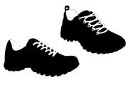
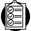
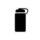
I'm really digging the reduced-realism kick we've been on in class lately, and obviously, as we learned over the course of several readings, simple graphics work really well on infographics. I tried to find something that fit each piece of information I was including.
As I've said before in class discussions, infograpics intimidate me, and I wasn't exactly sure how to go about starting one. After reading our materials for this week, I spent quite a bit of time looking through Nathan's Pinterest board with infographic examples, figuring out what format I liked and what I wanted to imitate.
I'm really digging the reduced-realism kick we've been on in class lately, and obviously, as we learned over the course of several readings, simple graphics work really well on infographics. I tried to find something that fit each piece of information I was including.


Screenshot mine, image found here
Process:
- I used the rounded rectangle tool, text tool, and pen tool to make and connect each little pod.
- Originally, I was working in black and white (just for simplicity while I was still formatting the thing). When I got to thinking about what color scheme I wanted to use, I relied heavily on Blake Stimac's "Choose the perfect colour palette for your website" article that Nathan sent us. I didn't follow the suggested ratios in the article so much (as I figured an infographic was a little different from a website), but I did basically choose a dominant color, a secondary color, and an accent color.
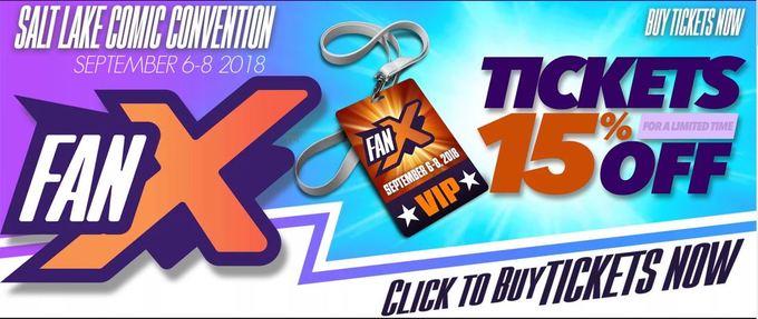
- Confession: I didn't invent the color scheme myself; because I worked with material coming from an established organization, I borrowed the color scheme already set in place. Salt Lake Comic Convention (formerly Salt Lake Comic Con; thanks, San Diego) uses shades of orange and purple accented with white, so that's what I chose. I specifically used the lighter orange and purple on the website banner when I pulled colors with the eyedropper tool because I thought they'd be easier to read and make a more pleasing infographic.
- I used the color range selector to isolate each silhouette from each image and made selections that I then painted over with the light orange I'd picked.
- Then it was just about nudging and sizing and manipulating the elements until they were where I wanted them to be.
- I pulled the FanX logo from the website banner and dropped that at the bottom, hoping to lend a sense of the infographic being "official."
- It'll never be noticeable on a white website, but I did put a white border around the infographic to contain it.
Design thoughts:
- Although in some places it was difficult for me to prioritize certain pieces of information over others, I did eventually settle on this specific order in keeping with the hierarchy of information. I tried to place information in direct descending order of importance; it's all solid information, but information at the top is more crucial than information at the bottom.
- I tried to design this infographic to easily direct the eye how I wanted it to. Information begins in the top(ish) left corner, and then the alternating pods and connecting lines draw the eye all the way down to the bottom. (Hopefully.)
- I used simple graphics for visual impact and to make the infographic easier to understand.
