NEW IMAGE:
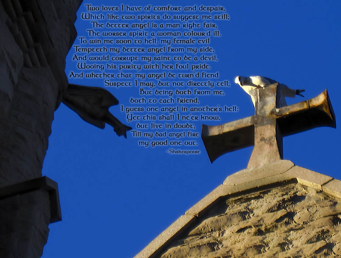
Original image by - Beth Icard
Way back when we did this assignment, I kind of misunderstood the scope of possibility, so I wanted to polish up this image a little. I followed the feedback Nathan gave me in the gallery by adding a shake reduction filter (not that you can tell on Weebly, but what can you do?) and lightening up the sky a little. This image has always reminded me of this particular Shakespeare sonnet, what with the sonnet's description of "better" angels and "worser" spirits, so I threw that on for funsies in a Celtic font, because why not, and with an outer glow.
OLD IMAGE:
Original image by - Beth Icard
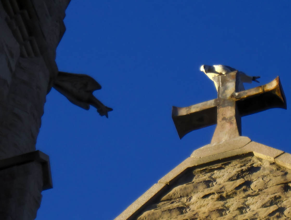
I took this photo for a class assignment years ago. Before I talk about anything else, I want to first acknowledge that, even after I fussed with it, this is not and never has been a perfect picture. I was using a really crappy camera set at its fullest zoom extent to catch an image of one object that was deeply shadowed and one which was blown-out in the sunlight. I have always been frustrated by the way it was colored -- it's so saturated that it looks fake, even though I didn't do anything to the color after the fact. (I've been equally frustrated by trying to tone down the saturation in Photoshop -- that isn't the correct solution either.) And I recognize that it ends up looking kind of flat or lacking depth, even after I worked with the highlights/shadows/etc. It's always been a really pixellated image and just . . . really problematic in a lot of ways. I have not succeeded in fixing all of its problems, I know. But because I really enjoyed the concept behind the image, I wanted to take this opportunity to try to fix it up a bit!
Untouched image
|

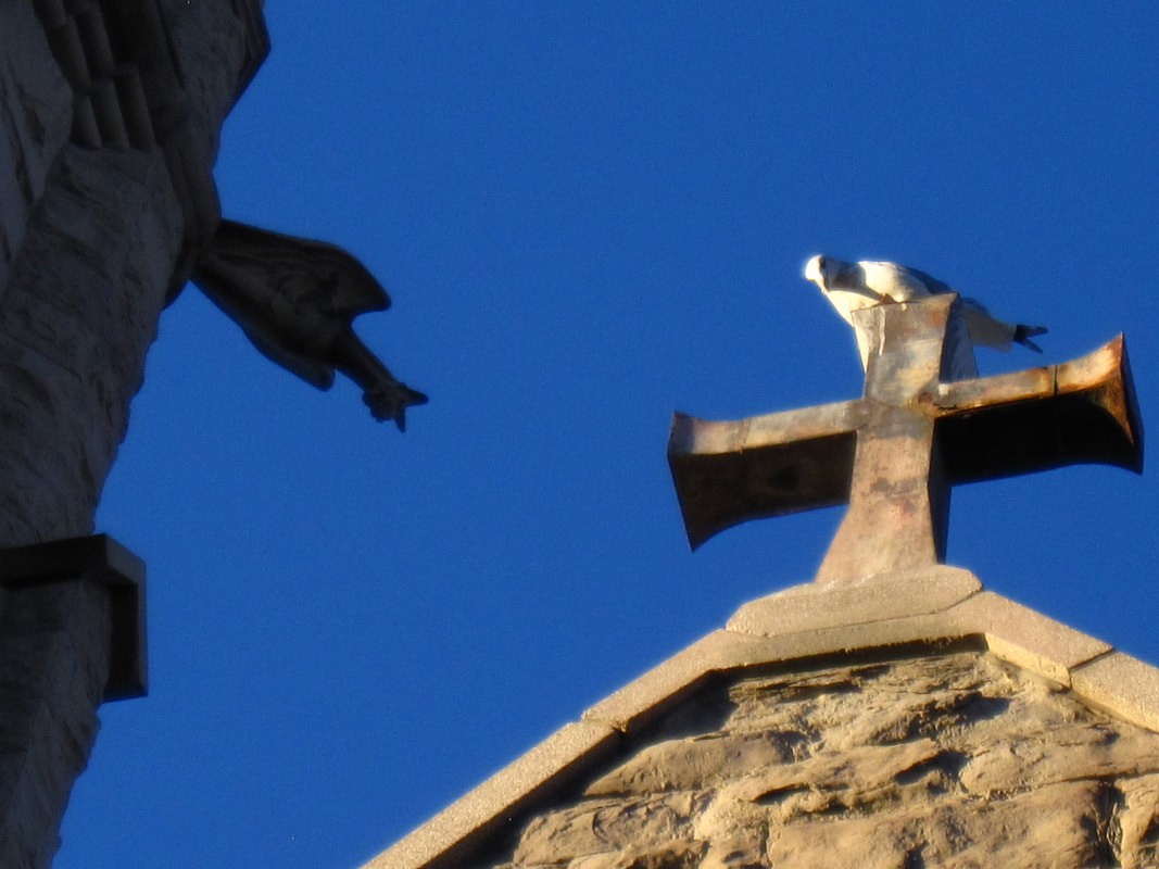
Photoshopped image (same as image above)
|
Process:
- I worked and worked over the image in Camera Raw.
- I corrected the exposure and color as best I could.
- Probably most importantly, I used the luminance and sharpening sliders to get rid of a lot of the nasty pixellation.
- Although we had a lot of new tools/processes available to us this week, I was most interested in using the content aware tools to fill in the edges after using the cropping tool to straighten an image, so that was what I focused on for this image.
- I used the straighten tool to fix my distorted horizon line (an unfortunate consequence of my standing so far below my subject while taking the picture).
- I used the magic wand tool to select the empty edges, expanded my pixel range, and filled with content aware matter.
- Holy cow, that was fascinating to watch! I was sure that the edges would end up looking strange; that the edges of the churches would confuse the process. How silly of me. Of course Photoshop could handle it!
Design thoughts:
- I allowed some of my whites and highlights to blow out without correcting them. I enjoyed the glowing effect it gave the seagull.
- Contrast: this week I let the elements of the image contrast against each other without going out of my way to "add" any contrast. The natural contrast was actually why I was interested in this image in the first place. I was standing between the Cathedral of the Madeleine and the First Presbyterian Church of Salt Lake City, and when I looked up, I noticed with delight that one of the Cathedral's gargoyles was entirely in shadow and the seagull that had decided to perch on top of First Presbyterian's cross was glowing in the sun like a freaking legitimate angel. I loved the contrast of the dark, "evil" gargoyle against the bright white "divine" seagull.
- Repetition: it's not perfect, but I think that the shape of the gargoyle kind of mimics the shape of the seagull.
- Alignment: it's kind of difficult to tell, I'm noticing now, but I did straighten the (theoretical) horizon line quite a bit.
- Proximity: I like how each "creature" is more or less situated on the same axis but on opposite outer thirds of the picture. I'm a little worried that the far edge of the cross is uncomfortably close to the right edge, but I also didn't want to crop in any closer and lose any of it.
- Typography: I chose not to incorporate any this week.
