Original image by - Beth Icard
Alrighty. So. I kind of winged it this week and took a shot at trying an idea I had in mind. It didn't quite end up the way I'd hoped, but I'm decently happy with the results. I drew inspiration from a couple of different specific places for this piece.
Inspiration 1
I'm not really much of a Star Wars fan (I'm a Trek girl, myself), but I am very much enjoying what's happening with the new trilogy. I loved The Force Awakens, and I'm pretty excited for The Last Jedi coming up soon. One of the things that most caught my eye in the official trailer for The Last Jedi was this odd little ice-fox creature-thing:
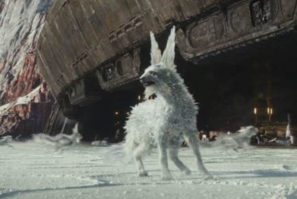
Image courtesy of The Last Jedi trailer, screenshot mine
|
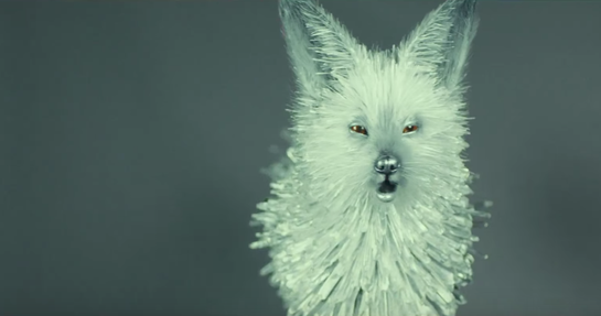
Image courtesy of Inverse.com
|
I got it in my head that I wanted to make my own version of this fun, pretty little creature. As much as I love foxes, I wanted to put my own spin on it and see how it would turn out if I tried to make an ice wolf instead.
Inspiration 2
I really, really loved Bethany Griffiths' portfolio exhibit last week. It caught my eye immediately -- it's so dramatic and beautiful and striking. I'm just in love. (Major kudos, Bethany!) I especially loved the mood of the piece, how it was all winter colors and mysterious and lovely. I kind of tried to borrow the mood she used and I put my own spin on it in my own project. Also, I hadn't originally intended to add any text to my piece this week, but I loved how well text worked with Bethany's image, so I shifted my conception of my project to include text of my own.
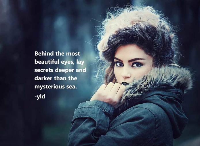
Original image by - Bethany Griffiths
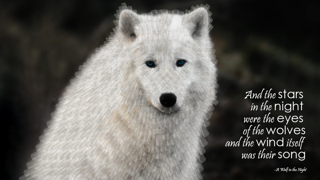
So. I had a rough concept. I had a couple of different inspirations. I had a direction, more or less. The first thing I did was find my wolf image:
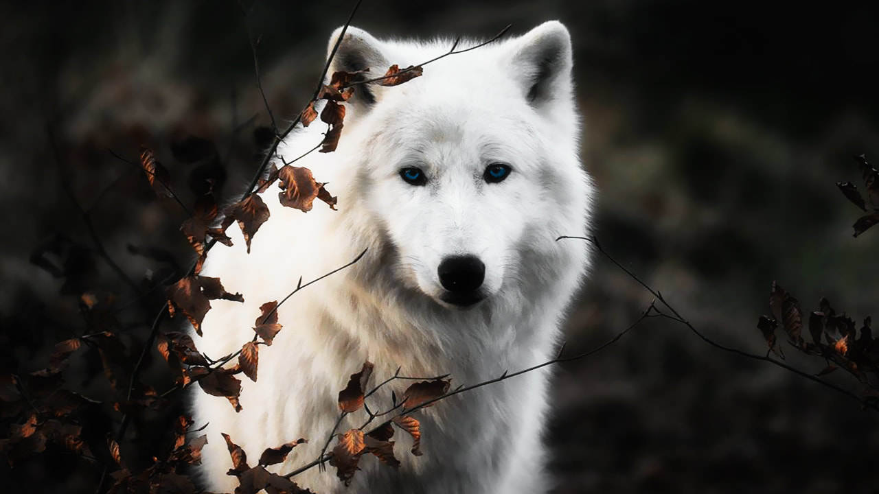
Image found here
Then I looked for something that could stand in for my ice crystals that I was planning to lay on over the wolf image. I tried using selections of actual ice crystals, but that didn't work at all. It looked nothing like I was hoping it would; it was actually kind of ridiculous. So, I decided to branch out from actual ice and see if a different kind of crystal would work for me. I settled on selenite crystals, and used a selection from this image (I only used the shape of the fourth crystal):
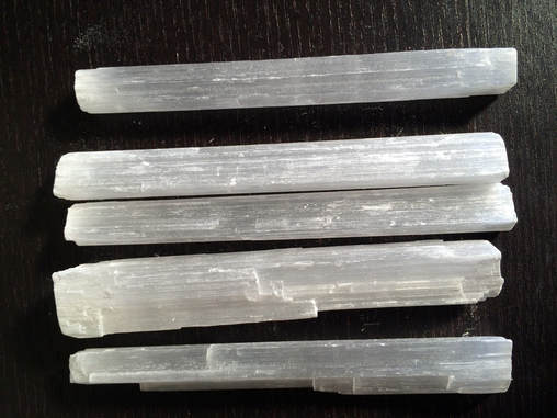
Image courtesy of Etsy
Process:
- I used a combination of the healing brush and clone stamp tools to completely erase the tree branches and leaves from the image, leaving me only with the wolf and the background.
- I made a selection of the selenite crystal I wanted to use, copied it into its own layer, and (god help me) went to town placing individual crystals over the image, using the transform tool to position, rotate, and resize the crystals. I kept the opacity at 30% so you could still see through the crystals, because I thought that would mimic the ice effect I was after. I quickly figured out that creating groups and copying groups into new layers was much better than laying individual crystals because I could cover larger areas at a time, but it was still an exhausting and frustrating process. XD
- When I got sick of being precise with the crystal groups, I started laying large groups of crystals, masking the layer, and then brushing over the pieces I didn't like rather than trying to find the exactly correct groups to copy in the first place. (I was working with groups within groups within groups at this point, so it was really easy to get lost and it was much easier to just throw down a large group of crystals, position the useful portion of it, and essentially erase the rest.)
- When my wolf was finally covered, I looked for a pretty wolf quote to insert and I used the text tool to do so.
Design thoughts:
- Like I said, this isn't quite the image I had in my head, but I'm pretty happy with it. If I'd had a good deal more patience (and a little more time) I could have been more careful about laying the crystals and made it look more like my inspiration creature, but I just got burned out on the process.
- I used a contrasting font to pull out key words in my quote that I wanted to draw attention to, and in order to add visual interest to the image.
- I aligned the text to the right, based on advice from last week's(?) readings, and I enjoyed the way that the left margin of the text kind of mimicked the shape of the right side of the wolf.
- I used white for the text both because it contrasted against the dark background and because it echoed the color of the wolf.
