Original image by - Beth Icard
So. It turns out that I'm deeply morally opposed to retouching. Huh. Who knew? I mean, I knew that I wasn't okay with it, but I didn't realize until I started working on this week's assignments that I actually have a paralyzing aversion to the practice.
I really enjoyed learning how to use all of the different retouching tools. They're amazing and powerful, and I'm glad that I have the ability to use them. I also really appreciate and applaud the fact that Nathan has been so careful to caution us against over-manipulating an image. I love his inclusion of the Dove videos in our weekly lesson. (Those are beautiful and important videos.) I understand that we have never been required to change an image beyond what is natural, a fact which I am glad of.
However, retouching in the media is such a huge and horrible problem that I just couldn't seem to get past my dislike of the practice this week. Hollywood and advertisers handpick special people who already have bodies that are smaller than anything most of us could ever even dream of having, and who have improbably -- almost inhumanly -- beautiful faces, but of course that alone is never enough. No, it's not enough that the actors and models we see every day are already more beautiful and more physically perfect than 95% of the rest of us . . . instead, retouchers get their hands on the images and change these people from improbable humans to impossible humans. Their bodies are made anatomically impossibly thin, entire chunks of flesh erased. Their skin is made impossibly flawless and perfect. The bone structure of their faces is altered with shadows and highlights, and often with the warp tool. Near perfect on its own isn't good enough; only perfection will do.
These are the images we're assaulted with all day, every day. Everywhere we look, we see these impossible people whose manipulated images set the impossible standard against which we are all judged. Of course, not only will most of us never look like the cover models we see -- not even the models themselves look like the finished product plastered across magazine covers because the images are so unnaturally altered.
Because these superhumans are all we ever see, and because few of us ever realize the extent to which the photos are manipulated, two things happen: one, we normalize these pretend versions of perfection, and two, we change our cultural standard of beauty to reflect them. It's a problem for both men and women, but I doubt many would argue that it's not more of an issue for women. It's no longer acceptable for a woman to walk around out in the "real world" without caking on enough makeup to mimic the flawless Photoshopped faces she sees in magazines. It's no longer acceptable for a woman to be a size 8 (which, by the way, is a very, very thin body size -- don't let anyone tell you any different); she has to be a size 2 -- and a size 0 is better, if you can manage it, honey. And God help you if you dare to be larger than an 8 . . .
A woman doesn't owe it to anyone to be "acceptably" pretty. A woman is under no obligation to look pretty. At any time. In any place. For anyone. She doesn't have to look pretty when she's lounging around the house in sweatpants watching Netflix. She doesn't have to look pretty when she runs to the grocery store to pick up the eggs she forgot to buy yesterday. She doesn't have to look pretty when she's leaving the gym drenched and exhausted. She doesn't have to look pretty when she drags herself out of bed to sit in a classroom at 8:00 in the morning. A woman should never be obligated to go to the effort of deliberately altering her appearance to make herself pretty for others.
By "pretty," here, I mean "conforming to unnatural and artificial beauty standards." So many people in the world are beautiful, unique, interesting-looking, gorgeous human beings without a stitch of help in the form of makeup or clothing. That's not what I mean. There is nothing wrong with being pretty, obviously. There is nothing wrong with liking being pretty. There is also nothing wrong with enjoying altering your appearance by artificial means because you enjoy doing so. There is a huge difference between delighting in the rituals of makeup and clothing for yourself and feeling you must try to fit an impossible beauty standard. There is joy in using clothing and makeup and shoes and accessories to make you feel as good about yourself and as pretty as you can. There is joy is feeling pretty for yourself. But feeling pressured to change your appearance to fit a standard set by Hollywood, advertisers, and Photoshop retouchers? That is never okay.
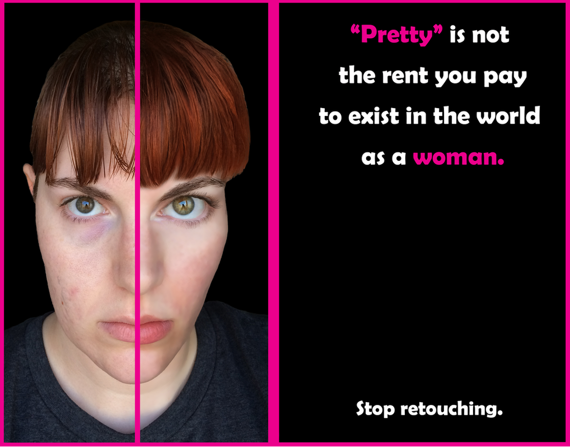
Being "pretty" (of the unattainable sort) is not a measure of a woman's worth. "Pretty" is not the rent you pay to exist in the world as a woman.
Retouching (to the extent to which it's used today) is a destructive and damaging practice. Retouching is dangerous. Retouching is harmful, and retouching makes the rest of us hate ourselves.
I really enjoyed learning how to use all of the different retouching tools. They're amazing and powerful, and I'm glad that I have the ability to use them. I also really appreciate and applaud the fact that Nathan has been so careful to caution us against over-manipulating an image. I love his inclusion of the Dove videos in our weekly lesson. (Those are beautiful and important videos.) I understand that we have never been required to change an image beyond what is natural, a fact which I am glad of.
However, retouching in the media is such a huge and horrible problem that I just couldn't seem to get past my dislike of the practice this week. Hollywood and advertisers handpick special people who already have bodies that are smaller than anything most of us could ever even dream of having, and who have improbably -- almost inhumanly -- beautiful faces, but of course that alone is never enough. No, it's not enough that the actors and models we see every day are already more beautiful and more physically perfect than 95% of the rest of us . . . instead, retouchers get their hands on the images and change these people from improbable humans to impossible humans. Their bodies are made anatomically impossibly thin, entire chunks of flesh erased. Their skin is made impossibly flawless and perfect. The bone structure of their faces is altered with shadows and highlights, and often with the warp tool. Near perfect on its own isn't good enough; only perfection will do.
These are the images we're assaulted with all day, every day. Everywhere we look, we see these impossible people whose manipulated images set the impossible standard against which we are all judged. Of course, not only will most of us never look like the cover models we see -- not even the models themselves look like the finished product plastered across magazine covers because the images are so unnaturally altered.
Because these superhumans are all we ever see, and because few of us ever realize the extent to which the photos are manipulated, two things happen: one, we normalize these pretend versions of perfection, and two, we change our cultural standard of beauty to reflect them. It's a problem for both men and women, but I doubt many would argue that it's not more of an issue for women. It's no longer acceptable for a woman to walk around out in the "real world" without caking on enough makeup to mimic the flawless Photoshopped faces she sees in magazines. It's no longer acceptable for a woman to be a size 8 (which, by the way, is a very, very thin body size -- don't let anyone tell you any different); she has to be a size 2 -- and a size 0 is better, if you can manage it, honey. And God help you if you dare to be larger than an 8 . . .
A woman doesn't owe it to anyone to be "acceptably" pretty. A woman is under no obligation to look pretty. At any time. In any place. For anyone. She doesn't have to look pretty when she's lounging around the house in sweatpants watching Netflix. She doesn't have to look pretty when she runs to the grocery store to pick up the eggs she forgot to buy yesterday. She doesn't have to look pretty when she's leaving the gym drenched and exhausted. She doesn't have to look pretty when she drags herself out of bed to sit in a classroom at 8:00 in the morning. A woman should never be obligated to go to the effort of deliberately altering her appearance to make herself pretty for others.
By "pretty," here, I mean "conforming to unnatural and artificial beauty standards." So many people in the world are beautiful, unique, interesting-looking, gorgeous human beings without a stitch of help in the form of makeup or clothing. That's not what I mean. There is nothing wrong with being pretty, obviously. There is nothing wrong with liking being pretty. There is also nothing wrong with enjoying altering your appearance by artificial means because you enjoy doing so. There is a huge difference between delighting in the rituals of makeup and clothing for yourself and feeling you must try to fit an impossible beauty standard. There is joy in using clothing and makeup and shoes and accessories to make you feel as good about yourself and as pretty as you can. There is joy is feeling pretty for yourself. But feeling pressured to change your appearance to fit a standard set by Hollywood, advertisers, and Photoshop retouchers? That is never okay.
Being "pretty" (of the unattainable sort) is not a measure of a woman's worth. "Pretty" is not the rent you pay to exist in the world as a woman.
Retouching (to the extent to which it's used today) is a destructive and damaging practice. Retouching is dangerous. Retouching is harmful, and retouching makes the rest of us hate ourselves.
Process:
- I've had an idea about what I wanted to do for this assignment for awhile, actually, but when I came up with my concept several weeks ago, I was missing several Photoshop skills I was going to need. So I've had to patiently wait and learn my way through the last few lessons before tackling this one. :)
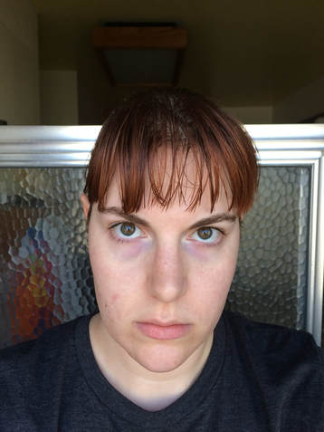
- The first thing I did for this assignment was take the "base" photo I wanted to use. I was by myself, and I actually had to stand in my shower in front of the window to get the light I wanted, bracing my hands on the window to make sure my camera wouldn't shake. The light was harsh and not particularly flattering, but I did that on purpose. I wanted to make a point, so I made sure that I wasn't accidentally hiding any imperfections with soft, flattering light and flattering angles.
- This is the image I ended up with:
Process, continued:
- I used the straighten feature of the crop tool to correct the slight tilt of my face, and then I cropped out the excess of the image.
- I used the lasso tool to select myself. Obviously, it wasn't a perfect selection, so I used the refine edge window to make it better. (Except I actually ended up perfecting the edge mostly manually with the brush in that window; edge refine wasn't really working for me.)
- I saved the selection, just in case, then copied the selection into a new layer. (Uh. My layers were kind of haphazard and random this week. I was muddling through, trying stuff I wasn't sure would work, and then copying my results into new layers so I could control them. My layers ended up sub-par and strange, but hey. I got there in the end.)
- With the rectangle marquee tool, I selected the left side of my face (well, the left half of the image; the right side of my face, technically, but who's keeping score?) and made that into a new layer. Then I did the same with the right side. I used the pen tool to define a black line between the two halves, so I could keep track of where I needed to be working.
- I didn't touch the left side of my face. I left it completely alone. I didn't even do anything to it in Camera Raw. This is what I look like. This is my face, flaws and all.
- On the right side, on the other hand . . . Let me tell you what, this was kind of a depressing project to work on in some ways. I had to take careful stock of just exactly what my flaws are, or what would be perceived as flaws by a retoucher, and I spent hours carefully shaping the right side of my face into something that conforms more to beauty standards than I do. Yeah. That was fun. *eyeroll* And the unsettling thing was, the longer I looked at the "perfected" image, the more normal it looked. Yeesh. What a horrifying thing to realize. But I digress.
- I filled the background layer with black and placed the image.
- Eyes:
- I used the polygonal marquee tool to select my right eye and eyebrow and jumped the selection to a new layer. With the transform tool in free transform and warp modes, I made my eye larger. I then used the clone stamp (in "lighten" mode) to heal the edges of the selection that no longer matched up with my skin.
- The purple skin below my eyes is a genetic quirk -- those are there whether I'm tired or not -- but obviously that is an "imperfection" that had to be dealt with. And as an added bonus, I was tired, so the area beneath my eyes was dark. Both of those things had to go. I used the clone stamp here, too, again in "lighten" mode. (That was working better for me than the healing brush.)
- I created a curve layer that was lighter than the image, inverted it, made it into a layer mask, and then brushed through the layer (at 58% opacity) to brighten my iris. Then I used the eyedropper to select one of the greens in my hazel iris, adjusted the color a little bit, and brushed a bit of paint into my iris (in "overlay" mode) to punch up the color just a tad -- not so much to change it, but to make it more obvious.
- I used the clone stamp to get rid of the bloodshot veins in the white of my eye.
- I used the eyedropper to select the color of my eyelashes, and then used the brush, set at only a pixel or two, depending on the location, to thicken and lengthen my lashes.
- Face:
- I used the warp tool in the liquefy filter to change the shape of my jawline and make my cheekbone look more prominent than it is.
- While I was there, I used the warp tool to make my lips bigger, and then I eyedropped one of the pinks in my lips, punched the color up a tad, and brushed on some paint ("overlay," again).
- I've struggled with my skin since I was thirteen years old (this was me on a really good day, actually -- could have been a lot worse). Feeling compelled to correct my skin, and also having the power to do so, was an experience that resulted in . . . mixed feelings. I cleaned up a few spots and then selected just the skin of my face and neck and surface blurred the selection, made the layer a mask, and brushed over my eyebrow, eye, and lips so they weren't blurred.
- I made both a lighter and darker curve layer, inverted them, and masked them. Then I brushed through the dark layer to create contouring shadows below my cheekbone, at the corner of my eye, along my nose, and under my lip. With the lighter layer, I brushed through some highlights on top of my cheekbone and browbone.
- Hair:
- My hair has always been fine, stick-straight, browner than I would like, and it tends toward the oily. When I took the picture, the red dye I use was pretty faded out and I hadn't yet washed my hair that day, so . . . the situation was less than ideal. Obviously, that needed to be fixed.
- I used the liquefy filter to add a bit of volume to the edge of my bangs.
- I selected a section of hair and copied it into several layers, then free transformed and warped the selections to fit the area as naturally as I could.
- I eyedropped one of the stronger reds in my hair, boosted the color manually, and then brushed it over the area (in "overlay" mode) to turn up the red.
- Final project:
- I saved the image of my face in a separate file, just in case. (For this class, I tend to first create an image I want to use, save it, and then drop it into a second file for the finished project. It . . . gives me a sense of control, I guess? I dunno.)
- I created a separate project and placed the image.
- With the pen tool, I made the pink border and central pink line. Then, because the black line down the image no longer looked right, I added a pink line in place of the black to separate the halves of my face.
- I placed the text, played with alignment and spacing, and finished the project.
- Whew! This one was hard, guys.
Design thoughts:
- On the one hand, I wanted to make a point with this image. I wanted to highlight how even the tiniest, most naturally-looking "fixes" in Photoshop can drastically change the way a person looks. (Which is a huge part of the reason why retouching is such a problem and why I have such an issue with it. Even minute adjustments set impossible standards.) So, because of that, I tried to keep my adjustments as "natural" looking as I could. I mean, I didn't really know what I was doing, so it probably reads as an obvious Photoshop job, but I did try to keep it looking "real."
- On the other hand, yes, I did deliberately exaggerate a few things. I probably made my eye bigger than a professional would have. And I deliberately slightly over-corrected my skin, over-smoothing it and letting it get that weird glowy thing that you see in magazines. But hey. I was trying to fit an anatomically unlikely standard. Not my fault. ;)
- I liked the black background because it's so dark and obvious and because it sets such a stage for my foreground to pop. Contrast!
- Similarly, I liked the pink because it's such a wild contrast against the black. I also chose pink on purpose because of its associations with femininity and beauty.
- I just picked the font because I liked it; there wasn't really any deeper thought here. However, I chose to make both "pretty" and "woman" pink for symbolic reasons and for emphasis.
- I knew I wanted the text at the top larger and more eye-catching, and I wanted the text at the bottom to be smaller and less immediately obvious. I had a little trouble with alignment, though. My first instinct was to left-align all of the text, but that ended up smooshing the text awkwardly next to the image, and I didn't like that. I tried really hard to like the text when it was right-aligned, especially after our reading this week, but it just didn't look right for this project. So, I went with good ol' option C and centered it. Whatever. I'm still not completely happy with the alignment, but I'm not really sure what else I could have done.
